Westlake Suburban Community

I completed this project my 4th year of school with professor Elizabeth Plater Zyberk. I was tasked with creating a suburban community across a 32 acre site in the town of Westlake Texas.
There were many challenges with this project, but the largest one was the topographic condition of the site. There were many areas along the site that were unbuildable or difficult to build on because the slope was too steep. This lead to many reiterations of the grand layout in order to create an elegant and logical plan.
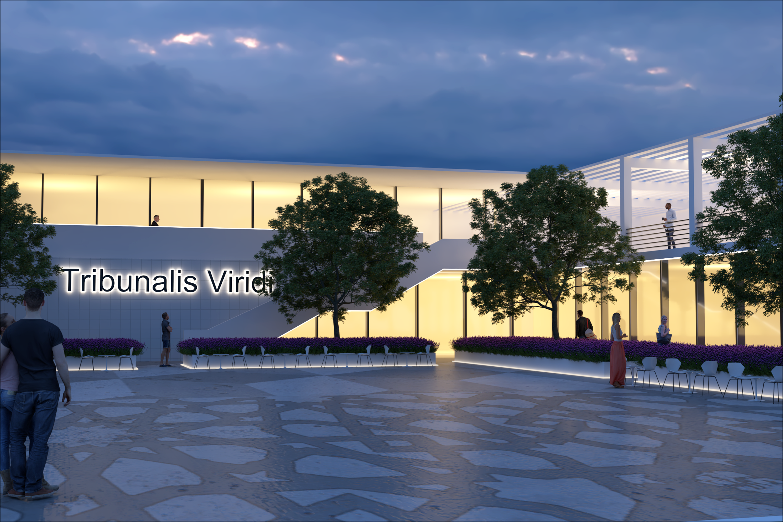
Two large design decisions I made was to envelope the entire site with trees to establish a sense of privacy and community, and the other was to connect my site with the Solana development to the North. I connected these two sites with a pedestrian bridge that not only clears the flood plain due to the river, but also leads into the Spanish stair inspired commercial strip of my development
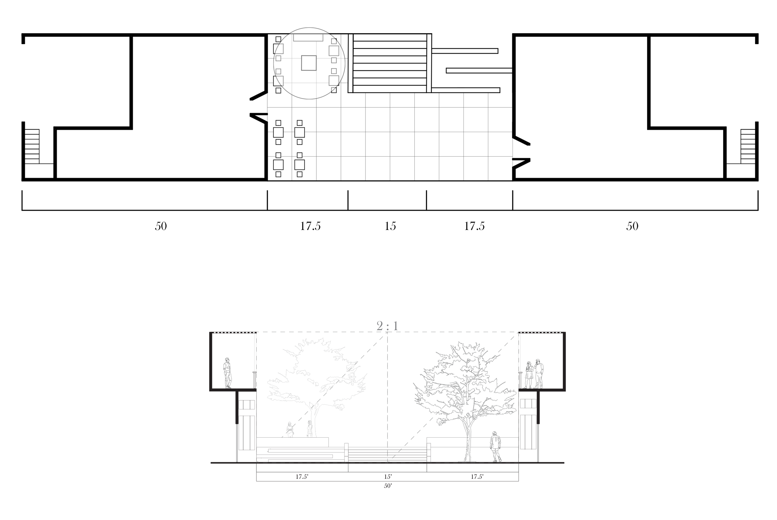
Creating a stepping motion with the buildings was an excellent way of dealing with the inclining topography as well as creating a unique pedestrian experience. The proportions of the pedestrian lane is based upon the famous Espanola way in Miami Beach, maintaining these proportions ensures the lane stays pedestrian friendly where the buildings don’t overpower the street. The red in the axon represents the location of the pedestrian lane, the green is where public parking and parking garages would be located, and the brown is areas where underground parking is accessible.
An important lesson I learned with this project is how smaller buildings can be used to tackle harsh slopes. This lead to the incorporation of many townhomes within my site as they were able to utilize land that larger apartment complexes could not. When designing these townhomes I took the approach of designing them from the façade to plan rather than vise versa. This allowed me to establish a strong relationship between the building and the street. I was also able to add some variety between units with the incorporation of operable screens. These screens suited the function of not only shading from the harsh Texas sun, but also were able to add subtle differences between façades as some occupants may like the screen all the way up, while other occupants may like it all the way down or some placement in-between.
The apartment buildings were my opportunity to drastically increase the density of the site. The apartment buildings are a basic courtyard style with a shard community space on the ground floor surrounding the courtyard.

What I learned as a designer from this project is when taking an urban design role you can’t design everything. The role of an urban designer is to instill guidelines that ensure the creation of successful spaces. This was a method of thinking that I had never done before as all of my previous studio projects were focused on one lot one building. Completing a studio class like this has made me more conscious to things like streetscapes, community building, and different methods of graphic representation.


